Be still my Roundsquare heart
My husband is used to it by now. The title sequence begins, and suddenly: “Ohhh that’s niiiiiccccceeee. Look! Kev, look!”
To him, it’s just type.
To me, it’s everything*.
Remember the double-storey 'g' in Killing Eve? I do. I do.
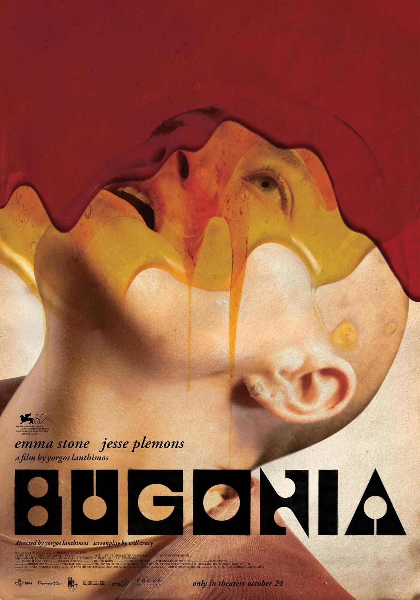
Theatrical poster for Bugonia.
Yorgos Lanthimos’ Bugonia is the latest example of title design done right. The use of Churchward Roundsquare is bold and beautiful—celebrating the geometric, retro, and otherworldly quirks of the typeface in all its glorious angles. Individual characters are spliced into the credits, perfectly juxtaposed against the elegant, sexy-but-sensible Adobe Garamond. It’s maximal impact, minimal fuss. Gosh, it’s good.

Trailer, Bugonia
Do I know what this movie is about? Not even slightly.
But I’m already obsessed. (And let’s be honest, Emma Stone has never missed.)
*I can't tell you why he married me, but I'm very glad he did.